Make Firefox fullscreen borderless on macOS
EDIT 2021-06-01: In Firefox 89+, there’s a default option “Hide Toolbar” in the fullscreen mode that automatically hides the toolbar. So the customization is no longer needed.
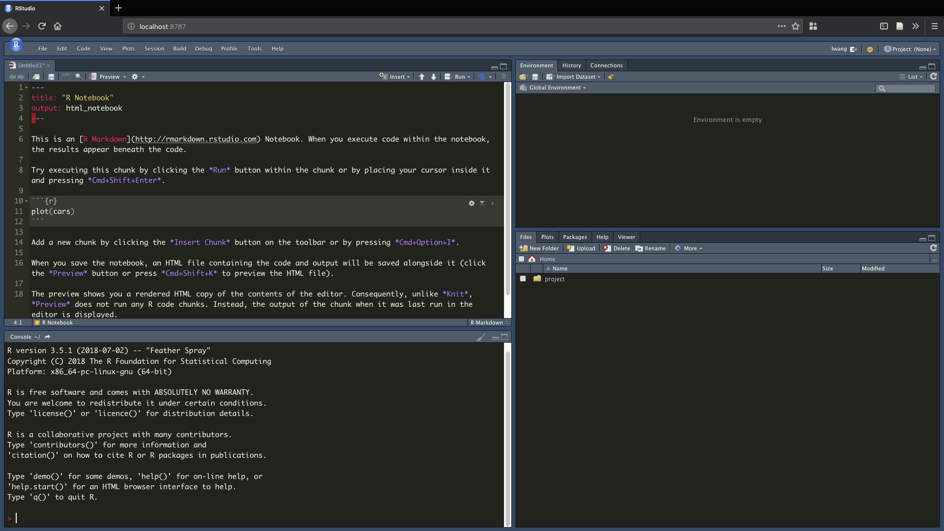
Firefox fullscreen on macOS by default contains the address bar and the tab bar. I usually don’t really need the full vertical space for web page, so those bars aren’t a problem. But when I access a RStudio Server on Firefox, I always want to have more vertical space. As shown in the screenshot below, the address bar and the tab bar of Firefox are unnecessary, and they may be quite distracting. If those bars are hidden and only show up upon request when Firefox enters fullscreen, the vertical space can be saved and the interface will remain clean.

It turns out that Firefox controls its user interface styling using CSS. So we can set the shape of the window tabs, the height of the address bar, and more by adding a CSS file at ~/Library/Application Support/Firefox/Profiles/<profile>/chrome/userChrome.css. In Firefox 69+, we need to set toolkit.legacyUserProfileCustomizations.stylesheets=true in about:config to enable the CSS styling (more details here).
My modification was based on this answer on Stack Exchange:
#navigator-toolbox[inFullscreen] {
    height: 0.5rem;
    margin-bottom: -0.5rem;
    opacity: 0;
    overflow: hidden;
    z-index: 1;
}

#navigator-toolbox[inFullscreen]:hover,
#navigator-toolbox[inFullscreen]:focus-within {
    /*
     * Add some padding between the navbar and the top screen edge
     * to be more visible while the macOS hidden menu bar shows up.
     * The macOS menubar will hide after a few seconds.
     */
    padding-top: 1.5rem;
    height: auto;
    margin-bottom: 0rem;
    opacity: 1;
    overflow: visible;
}
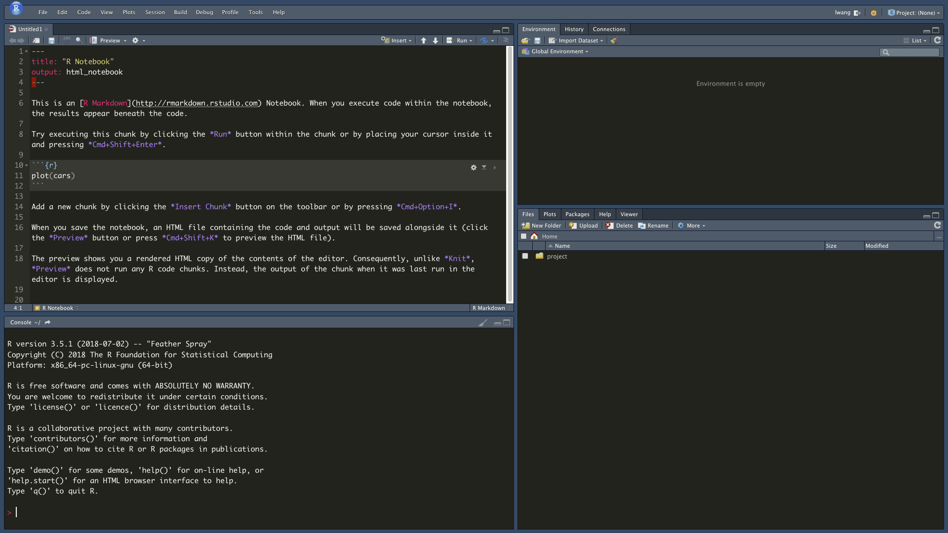
Note that the Firefox needs to be restarted to get the styling in effect. Here is how the Firefox fullscreen looks like after applying the userChrome.css above.

Now the RStudio Server web page feels like a native app, similar to what RStudio Desktop offers. Both address and tab bars are hidden by default, and when the mouse hovers to the top, they get visible again.
Those top bars will show up as well when they are in focus by shortkeys. For example, ⌘ + L will get focus on the address bar. It is useful when I want to launch a quick search in a new tab.
In userChrome.css, I added a small padding between the bars and the top border to make them more accessible by mouse. When the mouse moves to the top, macOS’s menu bar will pop up as well, and both Firefox and macOS will overlap. The macOS one will go away first, but the mouse has to stay on the Firefox bars so they don’t disappear either.
The overlapping of Firefox bars and macOS menubar is still a bit annoying, which will require some practice to navigate between them by mouse. I will probably rely more on the shortkeys instead. Anyway, I now have more vertical space and the modification of userChrome.css works fine for now.
For more information about modifying the Firefox user interface, there is a website that introduces userChrome.css in depth.
Notes for screencast encoding
I modified the command from my previous post to shrink the file size of the original QuickTime screencasts using FFmpeg. More encoding parameters can be found at FFmpeg’s wiki (VP9 and H.264).
# VP9 (WEBM)
ffmpeg -i fullscreen_switch_tabs.mov \
    -vcodec libvpx-vp9 -b:v 200K \
    -pass 1 -an -r 24 -f webm /dev/null
ffmpeg -i fullscreen_switch_tabs.mov \
    -vcodec libvpx-vp9 -b:v 200K \
    -pass 2 -an -r 24 fullscreen_switch_tabs.webm

# H.264 (MP4)
ffmpeg -i fullscreen_switch_tabs.mov \
    -vcodec h264 \
    -strict -2 -crf 40 -preset slow -r 24 \
    fullscreen_switch_tabs.mp4
EDIT 2020-06-13: Added extra about:config settings in Firefox 69+ and fixed the styling. I also increased the top margin since the new address bar is taller.