Taiwan R User Group, 2013.07.01
Hello, ggplot2
Introduce high-level R plotting package ggplot2
Slide and sources code are on
GitHub. A screencast is on Youtube.
Made by Liang Bo Wang under a CC 3.0 BY license.
← → PgUp PgDn Space to navigate, f for fullscreen and Esc for an overview.
About me
|
 |
今天主題
除了畫圖,還是畫圖
…… 聽起來有點 Low
想像一個情境 …
Deadline 前夕

等於開工的時候

source: hksilicon.com
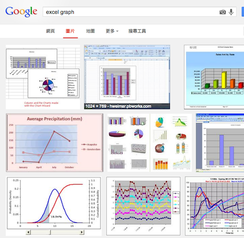
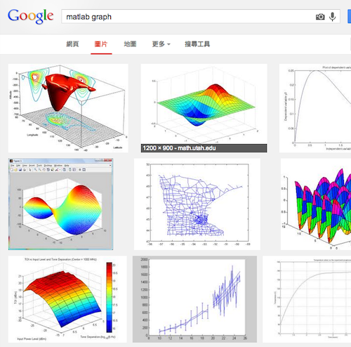
很容易生出這種圖表
| excel | matlab |
 |
 |
其實還不少 …
 |
 |
不好看…… 而且老闆會生氣
如果是 ggplot2 …
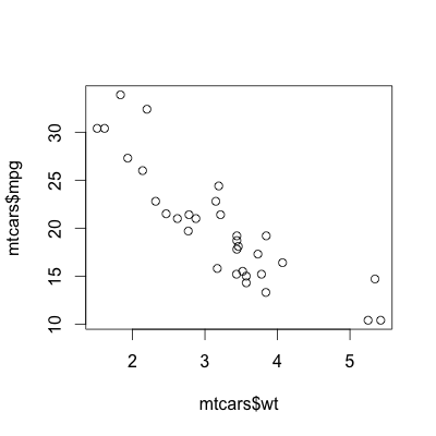
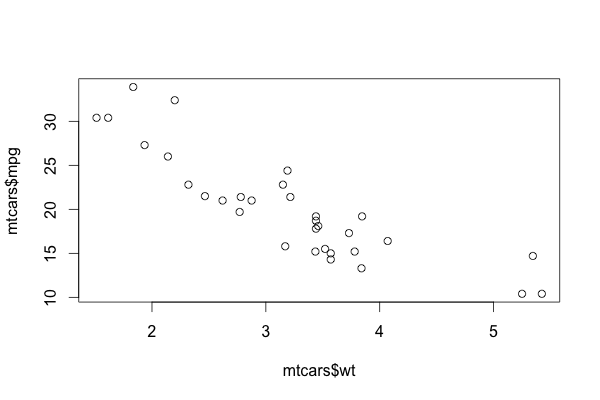
Basic R Plot vs ggplot2
# basic plot
plot(mtcars$wt, mtcars$mpg)

# using ggplot2
library(ggplot2)
qplot(wt, mpg, data=mtcars)

Reasons to use R and ggplot2
- 預設值即提供很好的樣式組合(style and layout)
- 各類型圖皆能以簡單指令完成(high-level)
- 以圖層的方式,有系統建構複雜、整合性圖表
- 搭配 R 統計分析,直接呈現資料樣貌
今天的目標
|

|
今天無法講到的主題
- 資料前處理
- 圖表資料結構 hack
- 細部調整 → 麻煩參考官網說明 or 參考書
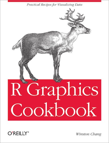
參考書
 |
 |
 |
| 主要參考這本 | R 基礎語法 | 詳細介紹 ggplot2 等 R 圖形套件 |
臺灣應該都買得到 Ex. 天瓏書局
目錄
什麼樣的資料適合作圖?
-
1 row = 1 observation 的
data.frame,csv, ... 檔案 - 格式奇怪的資料,可以透過 Python, R, sed/awk/... 來整理
- 找方法,不如直接問問 Stack Overflow 大神
# in namelist.csv
# data should be one observation per row
"First", "Last", "Sex", "Birth"
"Liang Bo", "Wang", "Male", "1991-01-01"
"Otsuka", "Ai", "Female", "1999-01-01"

# read from csv file
data <- read.csv("namelist.csv",
                 stringsAsFactors=FALSE,
                 comment.char='#')
data$Sex <- factor(data$Sex)
str(data)   # view data.frame structure
Give Data a Quick View
using basic R plot, ggplot()
and qplot()
sample code: ex_quick
Scatter | Line | Bar | Bar Count | Histogram | Box | Function
back to Quick
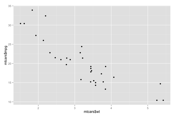
Scatter Plot
# basic
plot(mtcars$wt, mtcars$mpg)

# qplot()
qplot(mtcars$wt, mtcars$mpg, geom='point')
qplot(wt, mpg, data=mtcars)  # if they are in same data.frame

# ggplot()
ggplot(mtcars, aes(x=wt, y=mpg)) + geom_point()
| basic | qplot() or ggplot() |
 |
 |
back to Quick
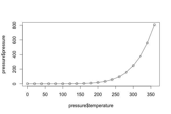
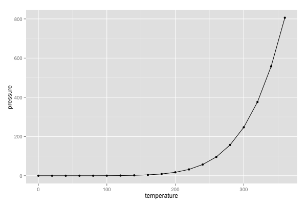
Line Plot
# basic
plot(pressure$temperature, pressure$pressure, type="l")
points(pressure$temperature, pressure$pressure)

# qplot()
qplot(pressure$temperature, pressure$pressure, geom=c('line', 'point'))

# ggplot()
ggplot(pressure, aes(x=temperature, y=pressure)) + geom_line() +
  geom_point()
| basic | qplot() or ggplot() |
 |
 |
back to Quick
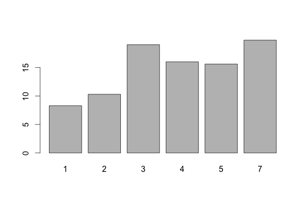
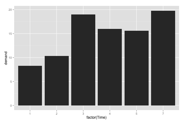
Bar Plot
# basic
barplot(BOD$demand, names.arg=BOD$Time)

# qplot()
qplot(factor(Time), demand, data=BOD, geom="bar", stat="identity")

# ggplot()
ggplot(BOD, aes(x=factor(Time), y=demand)) + geom_bar(stat='identity')
| basic | qplot() or ggplot() |
 |
 |
back to Quick
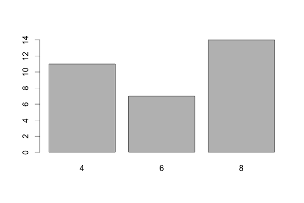
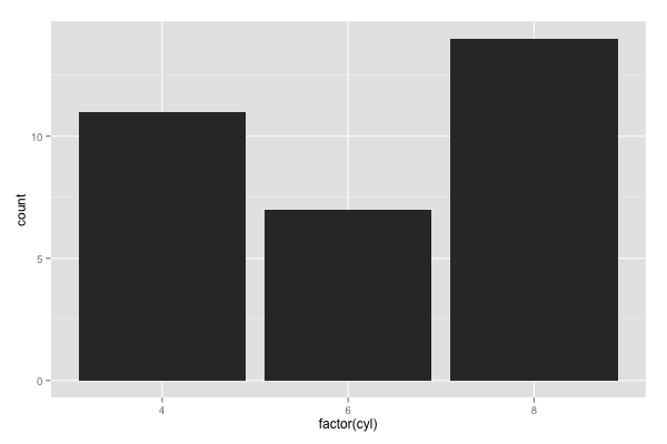
Bar Plot by Counting
# basic
barplot(table(mtcars$cyl))

# qplot()
qplot(factor(mtcars$cyl))   # no factor(), treat cyl as
                            # integer(continuous) not factors

# ggplot()
ggplot(mtcars, aes(x=factor(cyl))) + geom_bar()
| basic | qplot() or ggplot() |
 |
 |
back to Quick
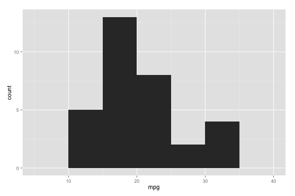
Histogram of 1-D data
# basic
hist(mtcars$mpg, breaks=10)

# qplot()
qplot(mpg, data=mtcars, binwidth=5)

# ggplot()
ggplot(mtcars, aes(x=mpg)) + geom_histogram(binwidth=5)
| basic | qplot() or ggplot() |
 |
 |
back to Quick
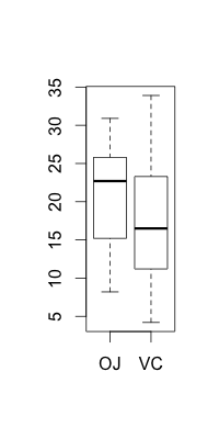
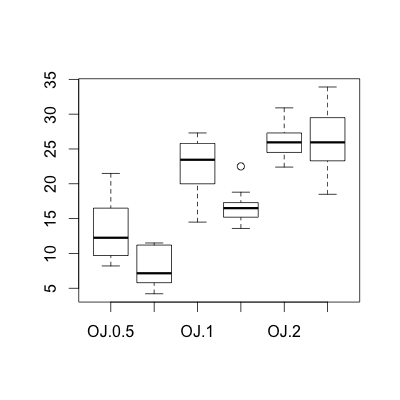
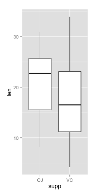
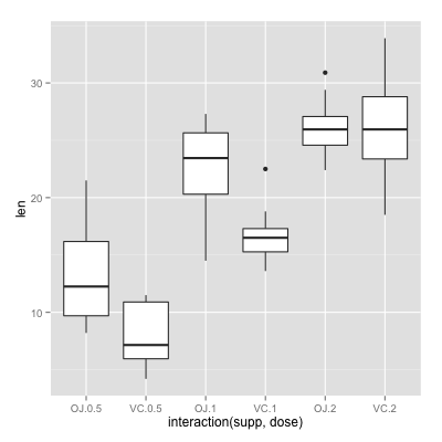
Box Plot
# basic (NOTE: outliers are different from ggplot results!)
plot(ToothGrowth$supp, ToothGrowth$len, names=levels(ToothGrowth$supp))
boxplot(len ~ supp, data=ToothGrowth)   # boxplot using formula syntax
boxplot(len ~ supp + dose, data=ToothGrowth)  # interaction: supp, dose

# qplot()
qplot(supp, len, data=ToothGrowth, geom='boxplot')
qplot(interaction(supp, dose), len, data=ToothGrowth, geom='boxplot')

# ggplot()
ggplot(ToothGrowth, aes(x=supp, y=len)) + geom_boxplot()
ggplot(ToothGrowth, aes(x=interaction(supp, dose), y=len)) + geom_boxplot()
 |
 |
 |
 |
back to Quick
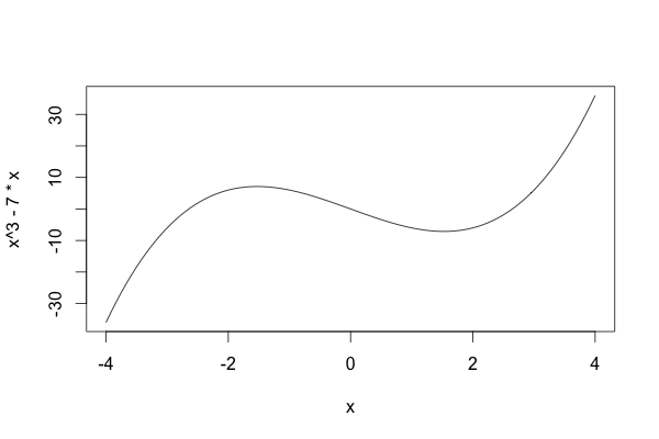
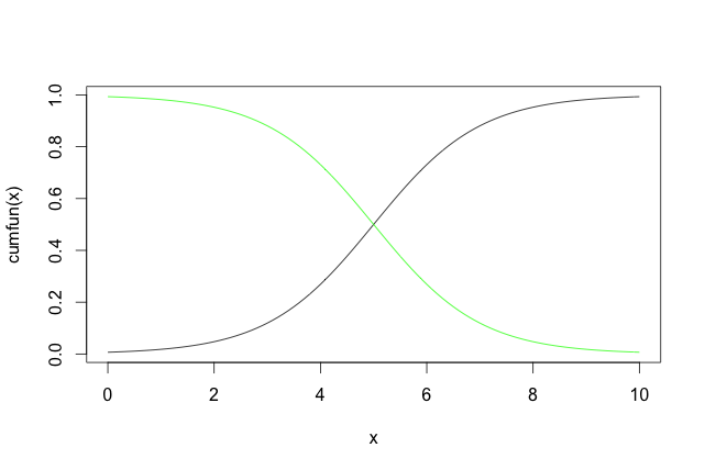
Function Curve
# basic
curve(x^3 - 7*x, from=-4, to=4)

# plot a user-defined function
# in: numeric vector, out: numeric vector
cumfun <- function(xvec) 1/(1 + exp(-xvec + 5))

curve(cumfun(x), from=0, to=10)
curve(1-cumfun(x), add=TRUE, col='green')   # append to same figure
| basic | basic (self-defined function) |
 |
 |
back to Quick
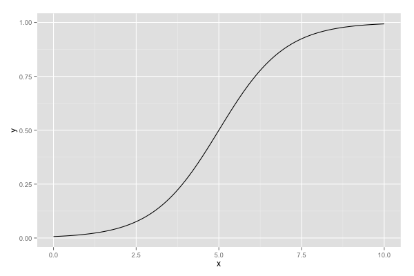
Function Curve (cont'd)
# qplot()
qplot(c(0, 10), fun=cumfun, stat='function', geom='line')

# ggplot()
g <- ggplot(data.frame(x=c(0, 10)), aes(x=x))   # store it first
g + stat_function(fun=cumfun, geom='line')  # try geom='point'
ggplot() | ggplot() (self-defined function) |
|
no straight forward way try wrapped by a function |
 |
Bar Plots
sample code: ex_bar
Not familiar? Start from Quick or back to Bar
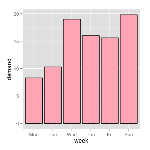
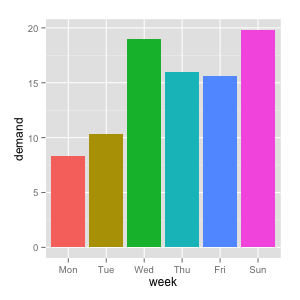
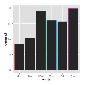
Set Fill and Color for Bar Plot
# use facters as x-axis
weekabbrv <- c('Mon', 'Tue', 'Wed', 'Thu', 'Fri', 'Sat', 'Sun')
BOD$week <- factor(BOD$Time, levels=1:7, labels=weekabbrv)

# set uniform color of fill(param: fill) or outline(param: color)
g <- ggplot(BOD, aes(x=week, y=demand))
g + geom_bar(stat='identity', fill='lightpink', color='black')

# using aes() to denote variable-dependent aesthetics
ggplot(BOD, aes(x=week, y=demand, fill=week)) + geom_bar(stat='identity')
ggplot(BOD, aes(x=week, y=demand, color=week)) + geom_bar(stat='identity')
 |
 |
 |
Not familiar? Start from Quick or back to Bar
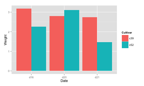
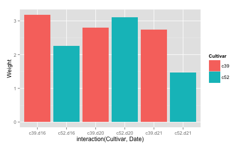
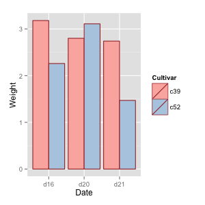
Grouping Bar Plot by Dodging
library(gcookbook)   # import required data sets

# === Grouping ===
# group var: Cultivar (determine the 'fill' color)
ggplot(cabbage_exp, aes(x=Date, y=Weight, fill=Cultivar)) +
  geom_bar(stat='identity', position='dodge')

# === Interaction ===
ggplot(cabbage_exp, aes(x=interaction(Cultivar, Date), y=Weight, fill=Cultivar)) +
  geom_bar(stat='identity')
| group | interaction |
 |
 |
Not familiar? Start from Quick or back to Bar
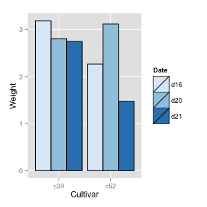
First into Color Theme using Bar Plot
library(gcookbook)
g <- ggplot(cabbage_exp, aes(x=Date, y=Weight, fill=Cultivar)) +
  geom_bar(stat='identity', position='dodge', color='brown')

# use different color themes, i.e., palettes
g + scale_fill_brewer(palette='Pastel1')  # try 'Blues' or 'Oranges'

ggplot(cabbage_exp, aes(x=Cultivar, y=Weight, fill=Date)) +
  geom_bar(stat='identity', position='dodge', color='black') +
  scale_fill_brewer(palette='Blues')
 |
 |
 |
Not familiar? Start from Quick or back to Bar
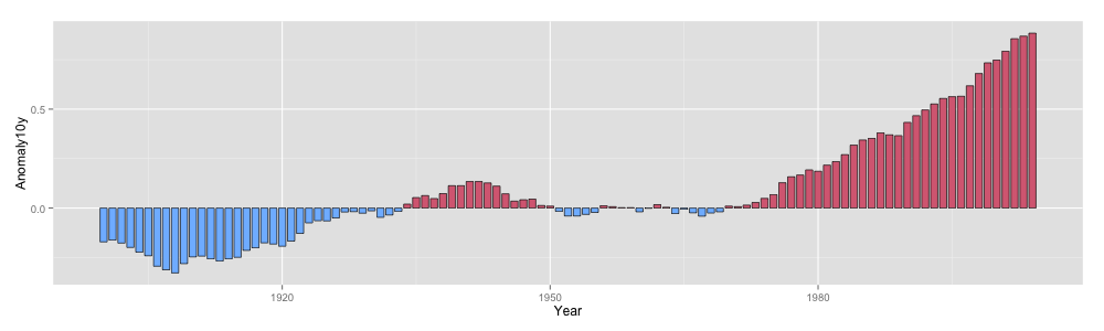
More on Conditional Coloring
library(gcookbook)
csub <- subset(climate, Source=='Berkeley' & Year >= 1900)
csub$pos <- csub$Anomaly10y >= 0

# define the position explicitly by "poisition='identity'"
g <- ggplot(csub, aes(x=Year, y=Anomaly10y, fill=pos))
g + geom_bar(stat='identity', position='identity') + guides(fill=FALSE)

# change the width of bars (var: width, default is 0.9) + custom coloring
g + geom_bar(stat='identity', position='identity',
             width=0.8, size=0.3, color='black') +
  scale_fill_manual(values=c('#80BBFF', '#D86C82'), guide=FALSE)
Not familiar? Start from Quick or back to Bar
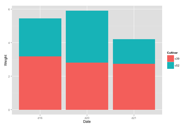
Stacked Bar Plot
library(gcookbook)
# for stacked bar plots (compared with Grouping by Dodging)
ggplot(cabbage_exp, aes(x=Date, y=Weight, fill=Cultivar)) +
  geom_bar(stat='identity')

# make a proportional (or 100%) stacked bar graph
library(plyr)
ce <- ddply(cabbage_exp, 'Date', transform,
            percent_weight = Weight / sum(Weight) * 100)
ggplot(ce, aes(x=Date, y=percent_weight, fill=Cultivar)) +
  geom_bar(stat="identity", color="black") +
  scale_fill_brewer(palette='Pastel1')
 |
 |
小結 ggplot2 設計觀點
qplot()適合用在簡單的繪圖上ggplot()ggplot2 的起手式aes(param=somevar, ...)使用離散變數(某一欄位)來改變繪圖的屬性(顏色、大小…)geom_xxxx()決定每一層畫圖的類型- 可以再額外疊加參數修改圖的設定
Line Plots
sample code: ex_line
y limit, log scale | Style | Group | Area | Stacked Area
Not familiar? Start from Quick or back to Line
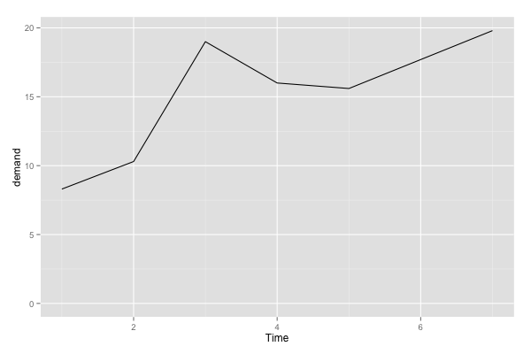
Control Y Axis of Line Plot
g <- ggplot(BOD, aes(x=Time, y=demand))
# change y limit (they have same results)
g + geom_line() + ylim(0, max(BOD$demand))
g + geom_line() + expand_limits(y=0)
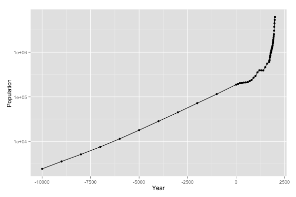
library(gcookbook)
# view y as log scale
ggplot(worldpop, aes(x=Year, y=Population)) +
geom_line() + geom_point() + scale_y_log10()
 |
 |
Not familiar? Start from Quick or back to Line
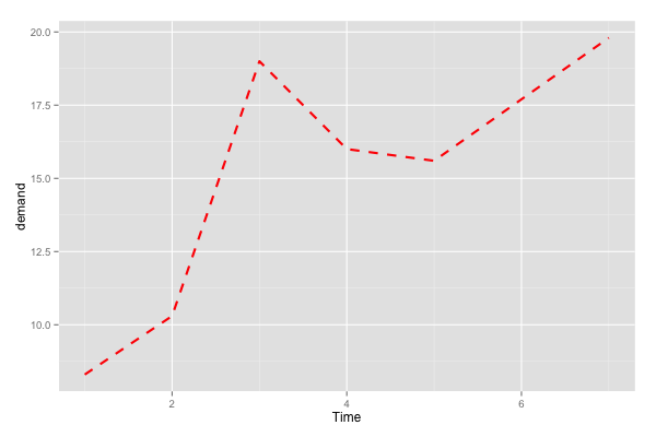
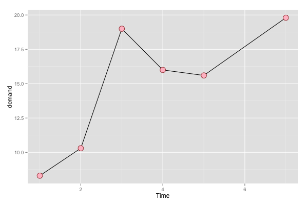
Change Line Plot Style
# change line style
ggplot(BOD, aes(x=Time, y=demand)) +
  geom_line(linetype='dashed', size=1, colour='red')

# change point style
ggplot(BOD, aes(x=Time, y=demand)) +
  geom_point(size=5, shape=21, colour='darkred', fill='pink') +
  geom_line()
Search "ggplot2" + "linetype" or "shape" for more information
 |
 |
Not familiar? Start from Quick or back to Line
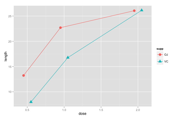
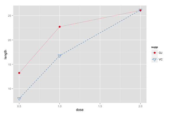
Grouping Line Plot
library(plyr)
tg <- ddply(ToothGrowth, c("supp", "dose"), summarize, length=mean(len))
g <- ggplot(tg, aes(x=dose, y=length, shape=supp, color=supp))
g + geom_line() + geom_point(size=4)  # supp determines both shape and color

g + geom_line(position=position_dodge(0.2)) +   # dodge lines and point
  geom_point(position=position_dodge(0.2), size=4)

ggplot(tg, aes(x=dose, y=length, shape=supp, color=supp, linetype=supp)) +
  geom_line() + geom_point(size=4) +  # styling
  scale_color_brewer(palette='Set1') + scale_shape_manual(values=c(20, 6)) +
  scale_linetype_manual(values=c('dotted', 'dashed'))
 |
 |
Not familiar? Start from Quick or back to Line
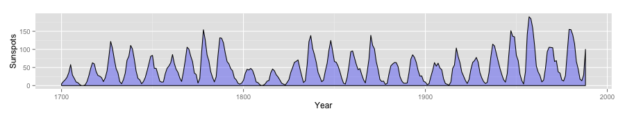
Shaded Area Line Plot
# convert sunspot.year into dataframe
sunspotyear <- data.frame(Year = as.numeric(time(sunspot.year)),
                          Sunspots = as.numeric(sunspot.year))
# using geom_area() for area plot
ggplot(sunspotyear, aes(x=Year, y=Sunspots)) +
  geom_area(color='black', fill='blue', alpha=.3)

# outline the area using geom_line()
ggplot(sunspotyear, aes(x=Year, y=Sunspots)) +
  geom_area(fill='blue', alpha=.3) + geom_line(color='black')
 |
 |
Not familiar? Start from Quick or back to Line
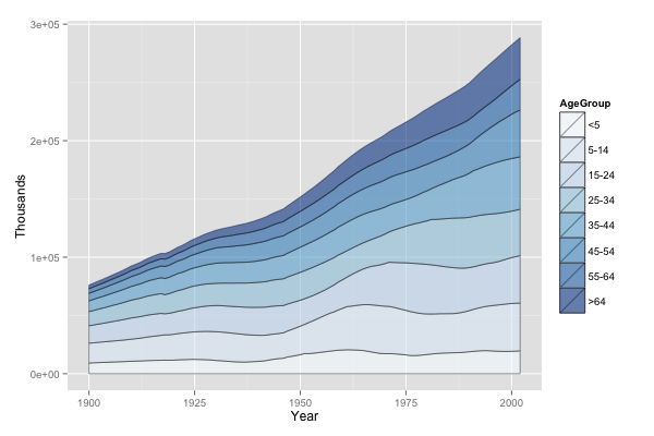
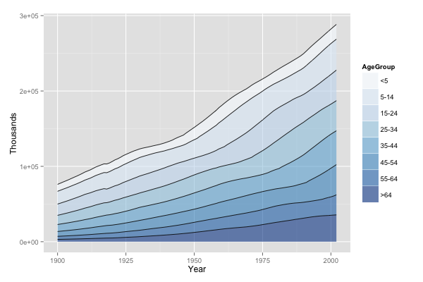
Stacked Area Line Plot
library(gcookbook)
head(uspopage)  # requires long format (wide -> long)

ggplot(uspopage, aes(x=Year, y=Thousands, fill=AgeGroup)) +
  geom_area(color='black', size=.2, alpha=.6) +
  scale_fill_brewer(palette='Blues')

# use descending order: desc() to reorder stacking order
library(plyr)
ggplot(uspopage, aes(x=Year, y=Thousands, fill=AgeGroup, order=desc(AgeGroup))) +
  geom_area(color=NA, alpha=.6) + scale_fill_brewer(palette='Blues') +
  geom_line(position='stack', color='black', size=.4)
 |
 |
可能想要先小試身手
看太多 code 太累了嗎? 不就畫個圖而已…
不如試試一個實例
Facets: Split Data into Subplots
sample code: ex_facet
facet_grid()限垂直/水平的排列facet_wrap()如同文字般繞排
Not familiar? Start from Quick or back to Facet
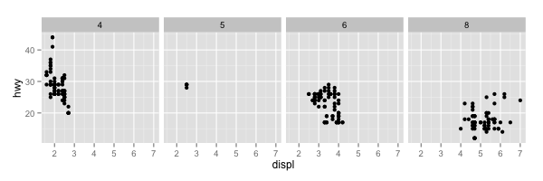
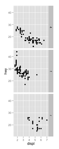
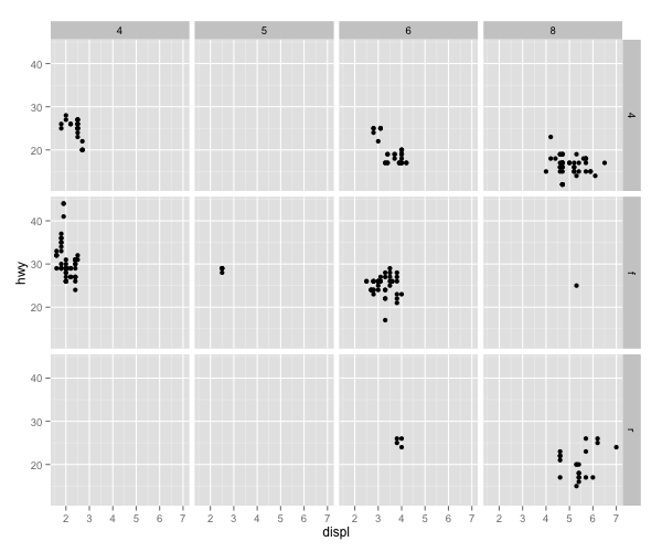
Facet Grid
# View(mpg)
g <- ggplot(mpg, aes(x=displ, y=hwy)) + geom_point()
g   # the original scatter plot

# what facet does here is that it treats the "original" data
# with a category variable(discrete var: drv), and plot the figure
# using same axis ranges but only "sub" data.

# now the category var: drv
g + facet_grid(drv ~ .)
# now the category var: cyl
g + facet_grid(. ~ cyl)

# now verticl var: drv, horizontal var: cyl
g + facet_grid(drv ~ cyl)
例子在下一頁
 |
|
 |
 |
Not familiar? Start from Quick or back to Facet
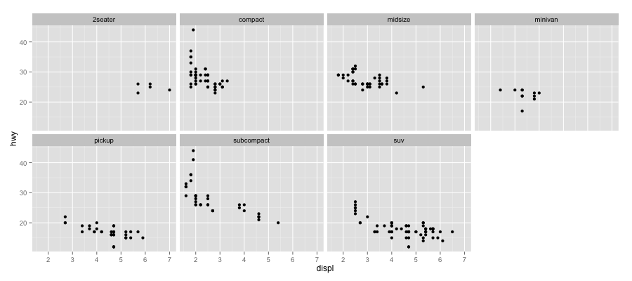
Facet Wrap
# continue from grid.R
g <- ggplot(mpg, aes(x=displ, y=hwy)) + geom_point()

# they have same result
g + facet_wrap(~ class, ncol=4)
g + facet_wrap(~ class, nrow=2)

好像也沒很簡單……
希望大家能掌握 ggplot2 設計的概念
用的時候能知道查哪些關鍵字

Deadline 前能查得到最重要!
有一天走在路上
想不到要用什麼 dataset 當範例
突然看到這個

......
不如就用教育相關的統計數字當範例
補習班的還沒收集好,多是廣告文宣
可能需要影像辨識,不好爬資料

Open Data? 不如試試教育部的統計資料
教育部 → 重要教育統計資訊 (link)

感覺都蠻好戰的 XD
來個禮貌的起手式
使用的資料表
back to Edu Dataset
大學生就讀類科之比率
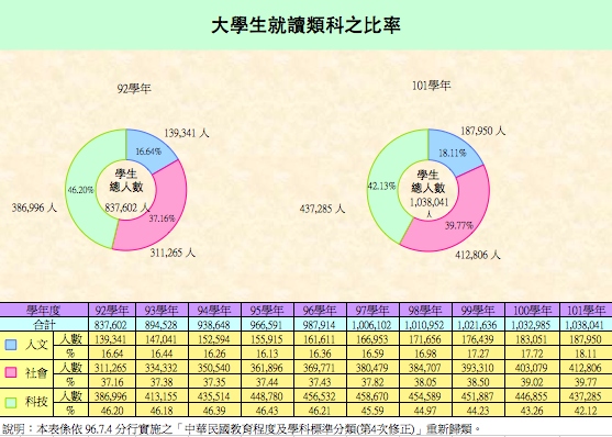
如果我們想要看 92 - 101 學年度類科變化的趨勢…
Start from begin, or back to Edu Dataset
Demonstrating Bar Plots
使用 Dodged, Stacked, Percentage Stacked 三種方式作圖
g <- ggplot(twCD, aes(x=schoolyear, y=count, fill=category))
# dodge
g + scale_fill_brewer(palette='Set2') +
  geom_bar(stat='identity', width=0.8, alpha=.8,
           position=position_dodge(0.7))
# stack
g + geom_bar(stat='identity', color='black') +
  scale_fill_brewer(palette='Pastel1')

library(plyr)
# === Proportional Stacked Plot ===
twCD <- ddply(twCD, "schoolyear", transform,
              percent_count = count / sum(count) * 100)
ggplot(twCD, aes(x=schoolyear, y=percent_count, fill=category)) +
  geom_bar(stat='identity', color='black') +
  scale_fill_brewer(palette='Set3')
完整的原始碼請參考 source code
Start from begin, or back to Edu Dataset
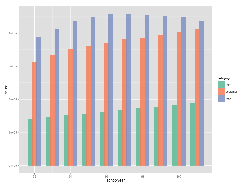
Dodged
Start from begin, or back to Edu Dataset
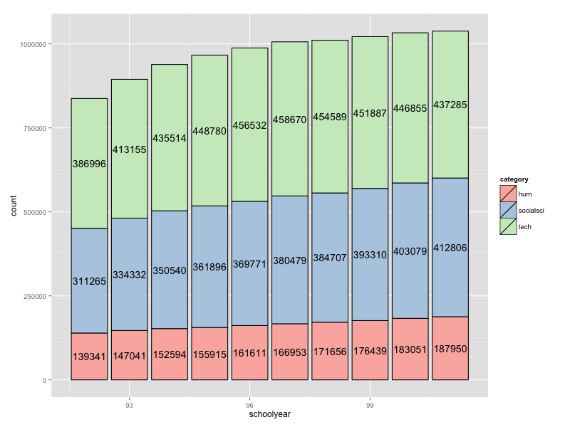
Stack
Start from begin, or back to Edu Dataset

Percentage Stack
back to Edu Dataset
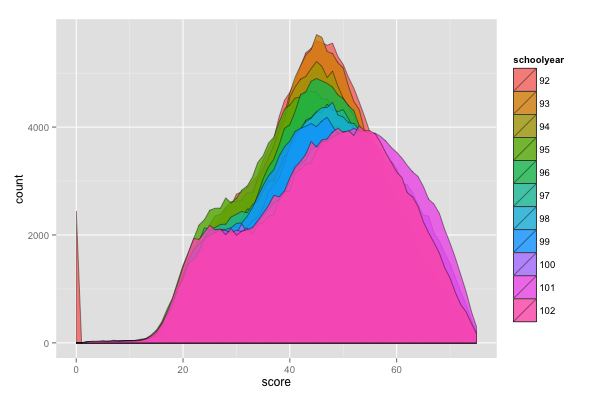
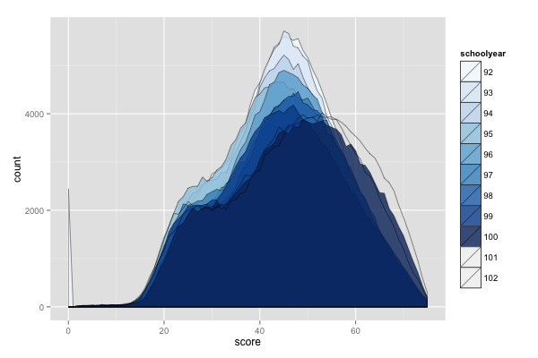
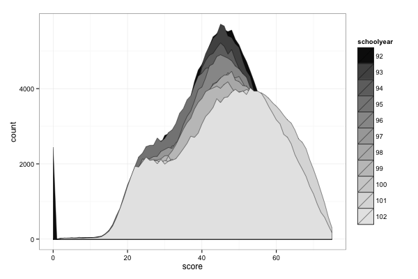
大學學測總級分人數分布

ggplot2 馬上就可以派上用場
但這筆資料很奇怪,分別存成 1, 2, 3 三檔
相關整理過程放在 twPT2013.csv, read_csv.R 中
Start from begin, or back to Edu Dataset
Demonstrating Line/Area Plots
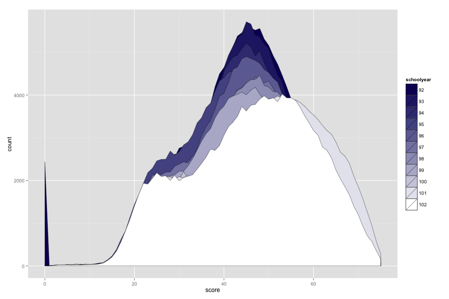
Overlapped Area Plot
twPT$scorecls <- cut(twPT$score, breaks=c(seq(from=-1, to=70, by=10), 75),
                     labels=c('<10', '10-19', '20-29', '30-39', '40-49',
                              '50-59','60-69', '> 69'))
g <- ggplot(twPT, aes(x=score, y=count, group=schoolyear, fill=schoolyear))
g + geom_area(alpha=.8, position='identity', color='black', size=0.2)

# Palette using 'Blues' (warning: no enough defined colors)
g + geom_area(alpha=.8, position='identity', color='black', size=0.2) +
  scale_fill_brewer(palette='Blues')

# custom gradient function
bluegrad_fnt <- colorRampPalette(c('#0C0C63', 'white'))
g + geom_area(alpha=1, position='identity', color='black', size=0.2) +
  scale_fill_manual(values=bluegrad_fnt(11))

g + geom_area(alpha=1, position='identity', color='black', size=0.2) +
  scale_fill_grey(start=0.05, end=0.9) + theme_bw() # grey
(結果在下一頁)
完整的原始碼請參考 source code
Start from begin, or back to Edu Dataset
Result
 |
 |
 |
 |
||
Start from begin, or back to Edu Dataset
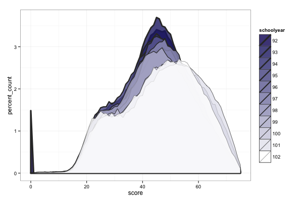
Normalized Area Plot
library(plyr)
twPT <- ddply(twPT, "schoolyear", transform,
              percent_count = count / sum(count) * 100)
by(twPT$percent_count, twPT$schoolyear, sum)  # check the result

ggplot(twPT, aes(x=score, y=percent_count, group=schoolyear, fill=schoolyear)) +
  geom_area(alpha=1, position='identity', color='black', size=0.2) +
  scale_fill_manual(values=bluegrad_fnt(11))

Start from begin, or back to Edu Dataset
Line Plot
ggplot(twPT, aes(x=score, y=percent_count, group=schoolyear,
                 color=schoolyear, size=schoolyear)) +
  geom_line(position='identity') + theme_bw()
  scale_size_discrete(range = c(1.5, 0.2))

# combined with area plot
ggplot(twPT, aes(x=score, y=percent_count, group=schoolyear,
                 size=schoolyear, fill=schoolyear)) +
  geom_area(position='identity', alpha = 0.8, color='#333333') +
  scale_size_discrete(range = c(1.5, 0.2)) +
  scale_fill_manual(values=bluegrad_fnt(11)) + theme_bw()
 |
 |
Start from begin, or back to Edu Dataset
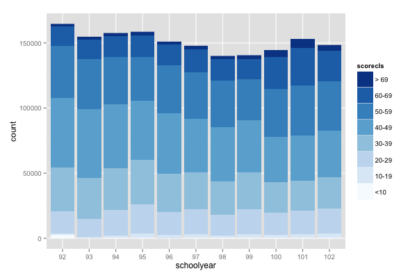
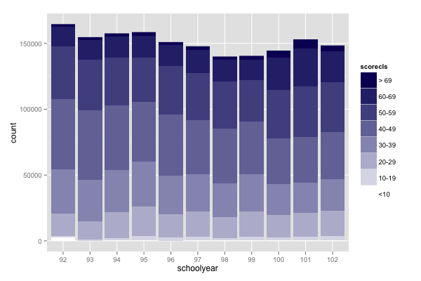
Stacked Bar Plot
# Now we plot the stacked bar plot
ggplot(twPT, aes(x=schoolyear, y=count, fill=scorecls)) +
  geom_bar(stat='identity') +
  scale_fill_brewer(palette='Blues', breaks=rev(levels(twPT$scorecls)))

# we define another set of colorPalette
bluegrad_inv_fnt <- colorRampPalette(c('white', '#0C0C63'))
ggplot(twPT, aes(x=schoolyear, y=count, fill=scorecls)) +
  geom_bar(stat='identity') +
  scale_fill_manual(values=bluegrad_inv_fnt(8),
                    breaks=rev(levels(twPT$scorecls)))
 |
 |
Start from begin, or back to Edu Dataset
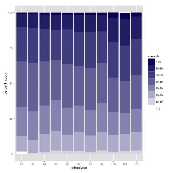
Percentage Bar Plot and Labeling
ggplot(twPT, aes(x=schoolyear, y=percent_count, fill=scorecls)) +
  geom_bar(stat='identity') +
  scale_fill_manual(values=bluegrad_inv_fnt(8),
                    breaks=rev(levels(twPT$scorecls)))
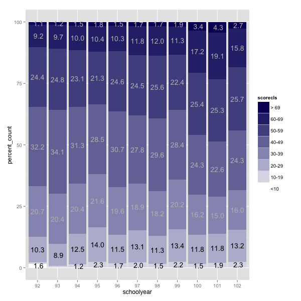
twptcls <- ddply(twPT, c("schoolyear", "scorecls"), summarise,
                 percent_count = sum(percent_count, na.rm=TRUE))
twptcls <- ddply(twptcls, "schoolyear", transform,
                 label_y=cumsum(percent_count) - 0.5 * percent_count)

formatter <- function(x, ...) {   # function to format label
  x[x < 1] <- 0   # we don't want to show numbers below 1
  format(round(x, digits=1), zero.print = FALSE, ...)
}

ggplot(twptcls, aes(x=schoolyear, y=percent_count, fill=scorecls)) +
  geom_bar(stat='identity', color=NA) +
  scale_fill_manual(values=bluegrad_inv_fnt(8),
                    breaks=rev(levels(twPT$scorecls))) +
  geom_text(aes(y=label_y, label=formatter(percent_count),
            color=scorecls), size=5) + guides(color=FALSE) +
  scale_color_manual(values=c(rep('black', 3), rep('grey', 5)))
結果在下一頁
Start from begin, or back to Edu Dataset
Result
 |
 |
What's Next? 今天沒提到的部份
- Scatter (Bubble) plot
- Annotations: text, line/arrow, shape(rectangle)
- Labels
- X, Y Axis, Legends
- Error bar
- Theme setting
- Many other types of plot: pie chart, box plot, ...
What's Next? Want More
- 搜尋 "ggplot2 tutorial"
- 看 ggplot2 官網
- 買本參考書 R Graphics Cookbook(本投影的 mindflow)
What's Next? Beyond Static
Q & A

The set of images are made by chibird.
Thank you for listening > <