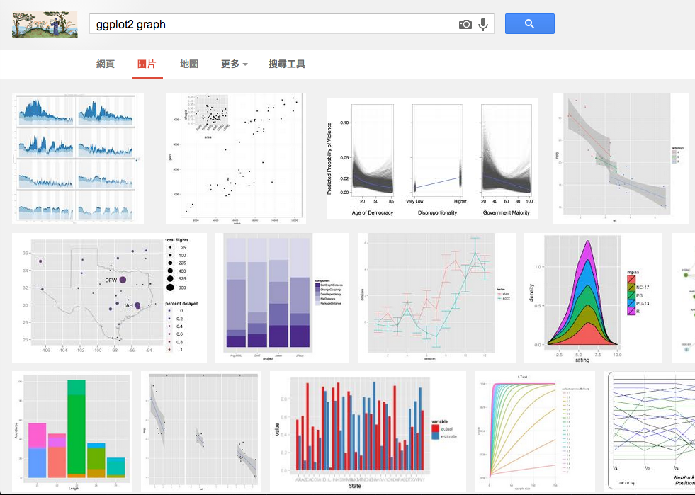
R Visualization - Using ggplot2
Liang Bo Wang (亮亮), 2013-12-06
From Taiwan R User Group, more info on Meetup.
Liang Bo Wang (亮亮), 2013-12-06
From Taiwan R User Group, more info on Meetup.
Online slide: http://ccwang002.github.io/2013-RConf-ggplot2-intro/
Liang Bo Wang (亮亮) Under CC 4.0 BY International License


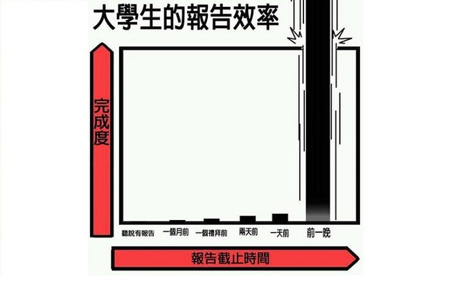
pic src: doingsomethingmoreforgod.blogspot.tw
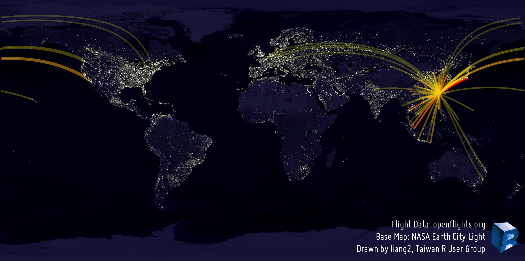
pic src: hksilicon.com
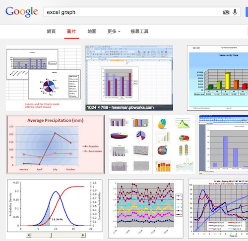
excel

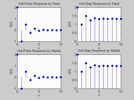
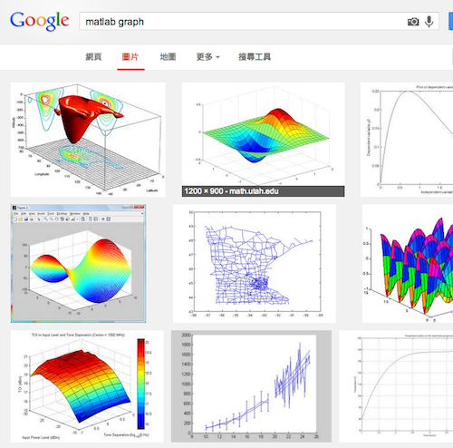
matlab

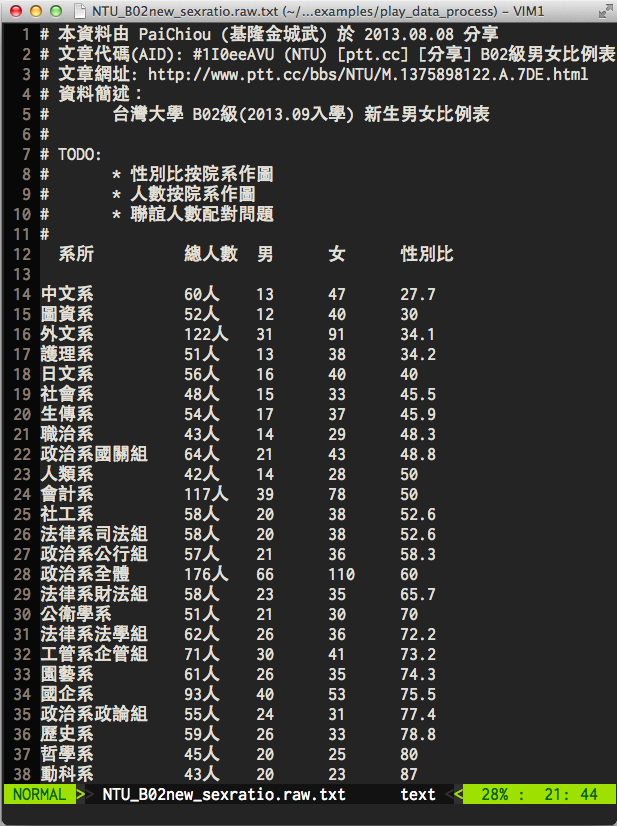
# 放在 Rcode/play_data_process
# 純文字,用 R 未必好操作
# 記得使用 UTF-8 不要 big5/cp950
df.ntu_sexratio <- read.table(
  'NTU_B02new_sexratio.raw.txt',
  comment.char="#",
  header=TRUE,
  strip.white=TRUE,
  stringsAsFactors=FALSE
)
# 把總人數中的 "人" 去掉
# 並且由字串轉成數字處理
df.ntu_sexratio[[2]] <- as.integer(
  strsplit(df.ntu_sexratio[[2]], "人")
)
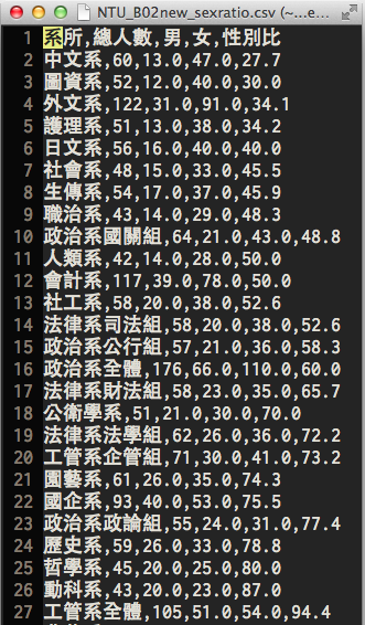
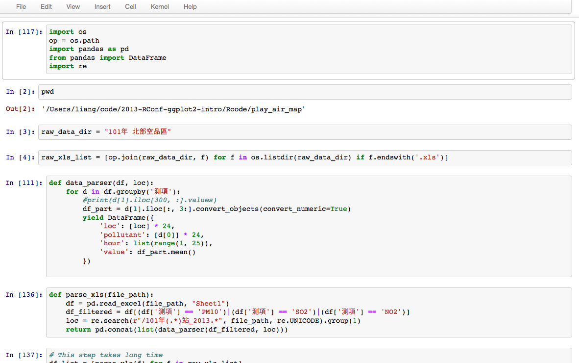
# 使用 Python3 處理
import pandas as pd
RAW_PATH = 'NTU_B02new_sexratio.raw.txt'
CSV_PATH = 'NTU_B02new_sexratio.csv'
df = pd.read_table(
    RAW_PATH,    # 檔案路徑
    sep='[ ]*',  # 分隔符號
    skiprows=11  # 忽略前 11 行不讀
)
df = df.dropna() # df.head() 可以看到第 0 列是 NaN (NA)
# 去「人」
df.ix[:, 1] = df.icol(1).apply(lambda x: x[:-1])
df.to_csv(CSV_PATH, index=False)  # 存檔
df2 = pd.read_csv(CSV_PATH)  # 測試,再讀回來
光這檔案就夠麻煩了
以轉成 CSV 為目標
在 R 內讀 CSV 非常方便
原生檔則可以用 excel 另存 CSV
data.frame 操作詳見
Subsetting, Advanced R programming by Hadley Wickham
df.ntu <- read.csv('NTU_B02new_sexratio.csv')
df.ntu[, c("女", "男")]
df.ntu[df.ntu$女 > 30, ]
df.ntu[df.ntu$女 > 30 & df.ntu$男 < 20, ]
summary(df.ntu)
ncol(df.ntu)
nrow(df.ntu)
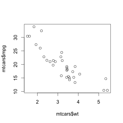
plot(mtcars$wt, mtcars$mpg)
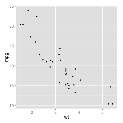
ggplot(mtcars, aes(x=wt, y=mpg)) + geom_point()
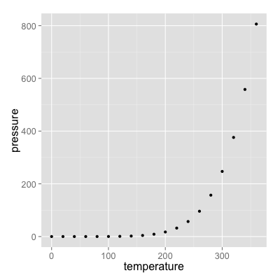
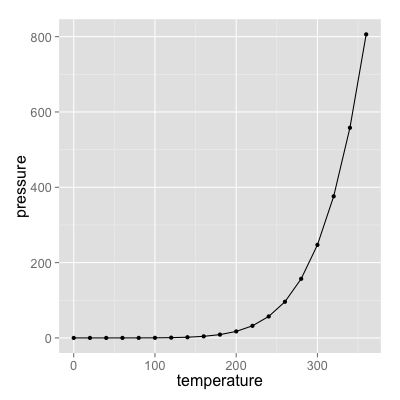
ggplot(pressure, aes(x=temperature, y=pressure)) +
  geom_line() + geom_point()
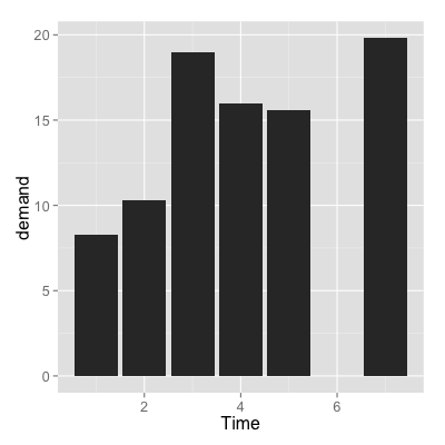
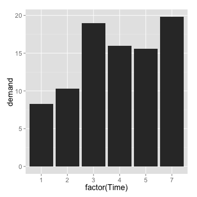
ggplot(BOD, aes(x=factor(Time), y=demand)) +
  geom_bar(stat="identity")
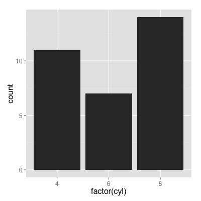
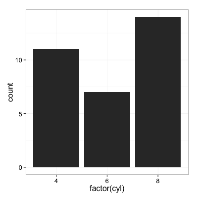
g <- ggplot(mtcars, aes(x=factor(cyl)))  # 先存起來
g + geom_bar(stat="bin")  # 可以一步一步接
g + geom_bar(stat="bin") + theme_bw(16)  # 改主題
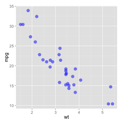
ggplot(mtcars, aes(x=wt, y=mpg)) + geom_point(color="blue", size=5, alpha=0.5)
ggplot(mtcars, aes(x=wt, y=mpg, color=gear)) + geom_point()
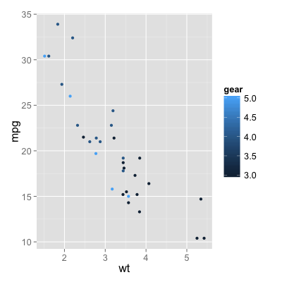
更改參數實際對應的值,用 scale_xxx(...)
g <- ggplot(
mtcars,
aes(x=wt, y=mpg, color=gear)
)
# 更改指定的顏色,目前是連續的
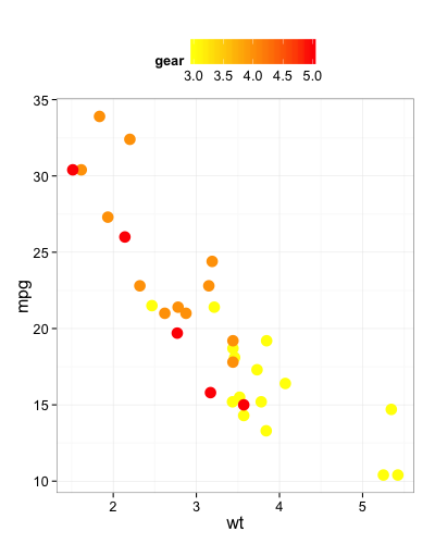
g + geom_point(size=5) +
scale_color_continuous(
low="yellow", high="red"
) + theme_bw(16) +
theme(legend.position="top")
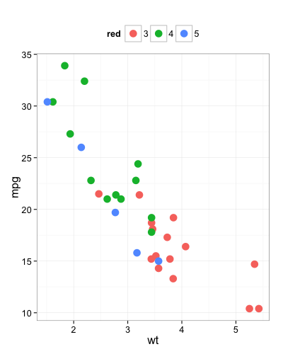
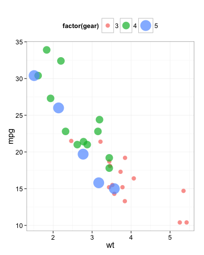
gear 其實只有幾個值 (3, 4, 5)
g <- ggplot(
  mtcars,
  aes(x=wt, y=mpg, color=factor(gear))
) + geom_point(size=5) + theme_bw(16) +
  theme(legend.position="top")
g  # 印預設結果
# 手動改顏色
g + scale_color_manual(
  values=c("red", "yellow", "purple")
)
# 系統內建色組
g + scale_color_brewer(palette="Set3")
aes(...) 一資料欄位可以同時指定多個參數
g <- ggplot(
  mtcars,
  aes(x=wt, y=mpg,
      color=factor(gear),
      size=factor(gear)
)) + theme_bw(16) +
  theme(legend.position="top")

g + geom_point(alpha=0.7) +
  scale_size_discrete(range=c(4, 10))
其他類型的圖都是同樣規則
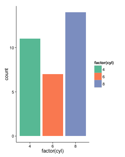
g <- ggplot(mtcars, aes(
  x=factor(cyl),
  fill=factor(cyl)
))

g + geom_bar(stat="bin") +
  scale_fill_brewer(palette="Set2") +
  theme_classic()

# 試著把 fill 改成 color
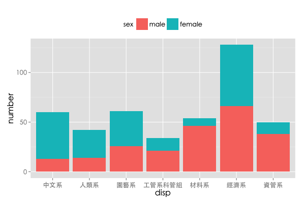
g <- ggplot(df.part,
aes(x=disp, y=number, fill=sex)) +
theme(text=element_text(
family="Heiti TC Medium",
size=18))
# Stack 男女疊在一起
g + geom_bar(stat="identity")
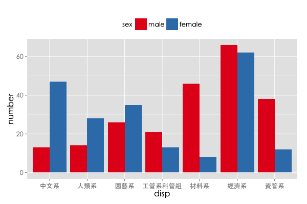
# Dodge 同科系男女靠比較近
g + geom_bar(stat="identity",
position="dodge") +
scale_fill_brewer(palette="Set1") +
theme(legend.position="top")
R 基礎語法
ggplot2 完整介紹
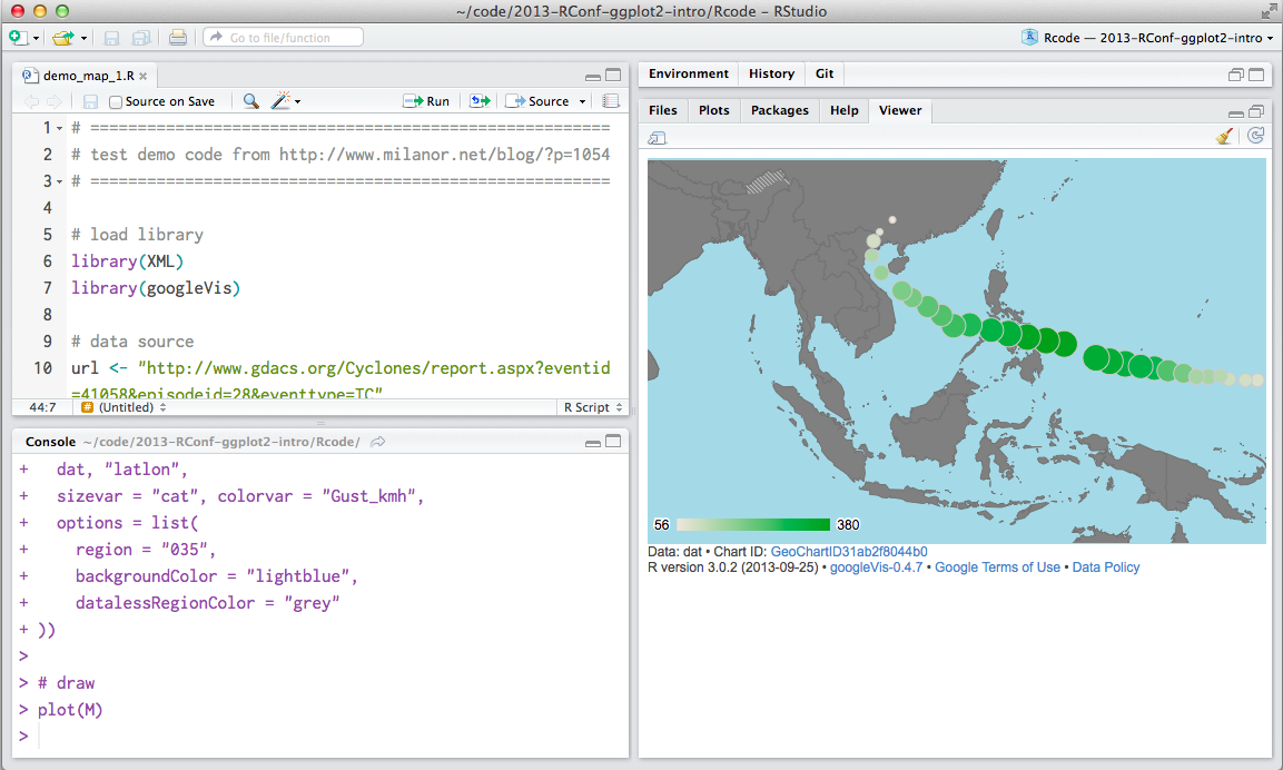
googleVis 現在跟 RStudio 有非常好的整合
g <- ggmap(
get_googlemap(
center=c(121.49, 25.04), # Long/lat of centre
zoom=10, maptype='satellite',
scale=2,
), extent='device', darken = 0
)
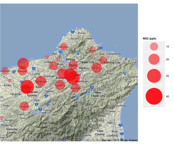
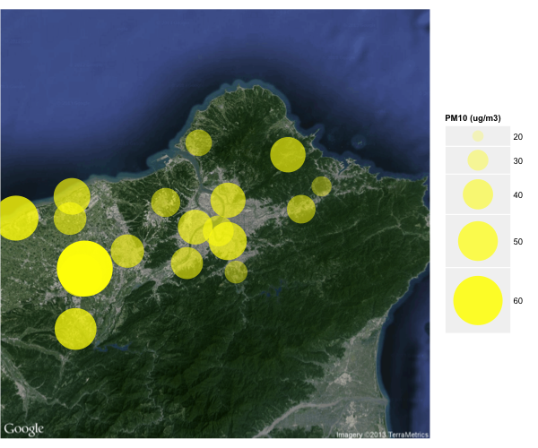
# given a data filtered by pollutant and hourtime
g + geom_point(
data=df.air[df.air$pollutant == "PM10", ],
aes(x=lon, y=lat, size=value, alpha=value),
color="yellow") +
scale_size_continuous(range=c(5, 30)) +
scale_alpha_continuous(range=c(0.2, 1))
靜態
動態